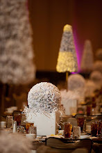
 Event Designers like me are heavily influenced by the color trends of the fashion industry. Luckily, the same colors that show up on New York's runways translate very well into an event design format. Well, maybe it's more than luck. Maybe it's a designer's understanding of how to adapt the color palette of a Toasted Almond, Aurora, Muted Clay and Feather Gray couture cocktail gown into an elegant but rustic wedding reception for 400 guests. There are universal themes in the world of color that work. Regardless of home decor, fashion, or event design cool colors including blue green and everything in between produce calm and warm colors including all variations of red, orange and yellow typically produce warmth, comfort, and enthusiasm. I avoid veering too wildly from what works; however, it is fun to give the color wheel a giant spin from time to time. Many factors are involved in color choice--the current season, the client's personality and/or signature color, the event venue, the economy.
Moving into Spring naturally evokes soothing hues from the blue green family like Turquoise and Ampara Blue; however, the down-turned economy continues to affect seasonal color choices. Cautious, pratical neutrals such as Tuscany, Dried Herb, Chalky Conch and Eucalyptus provide a subconscious safety net. Violet and Pink Champagne are two popular colors that lift those neutral spirits with a pastel punch. Rich Tomato Puree and Fusion Coral are newer colors in the event design vernacular. Eggplant, Tangerine, Yellow and Lemongrass continue to be part of the color dialect.
Though clients will likely continue to choose the softer more comforting colors for their "base color," they will also continue to select bolder, more optimistic bolts of color to vitalize their events. Unwittingly, by making the juxtaposition of a bold color against a neutral backdrop the client's signature color will make an even louder statement. Now front and center, color garners new status. Though color has always been of great importance, it is making a larger splash throughout the world of Event Design. A bold dose of color, in my opinion, is the "Wow Factor" of 2010.


No comments:
Post a Comment